Since last week has been called the worst week since 2008, I thought I would compare the charts from the two.
The first comparison is between the two weeks with the bars on each scaled to match SPX point moves (not percentage). 2008 is on the left, 2020 on the right:
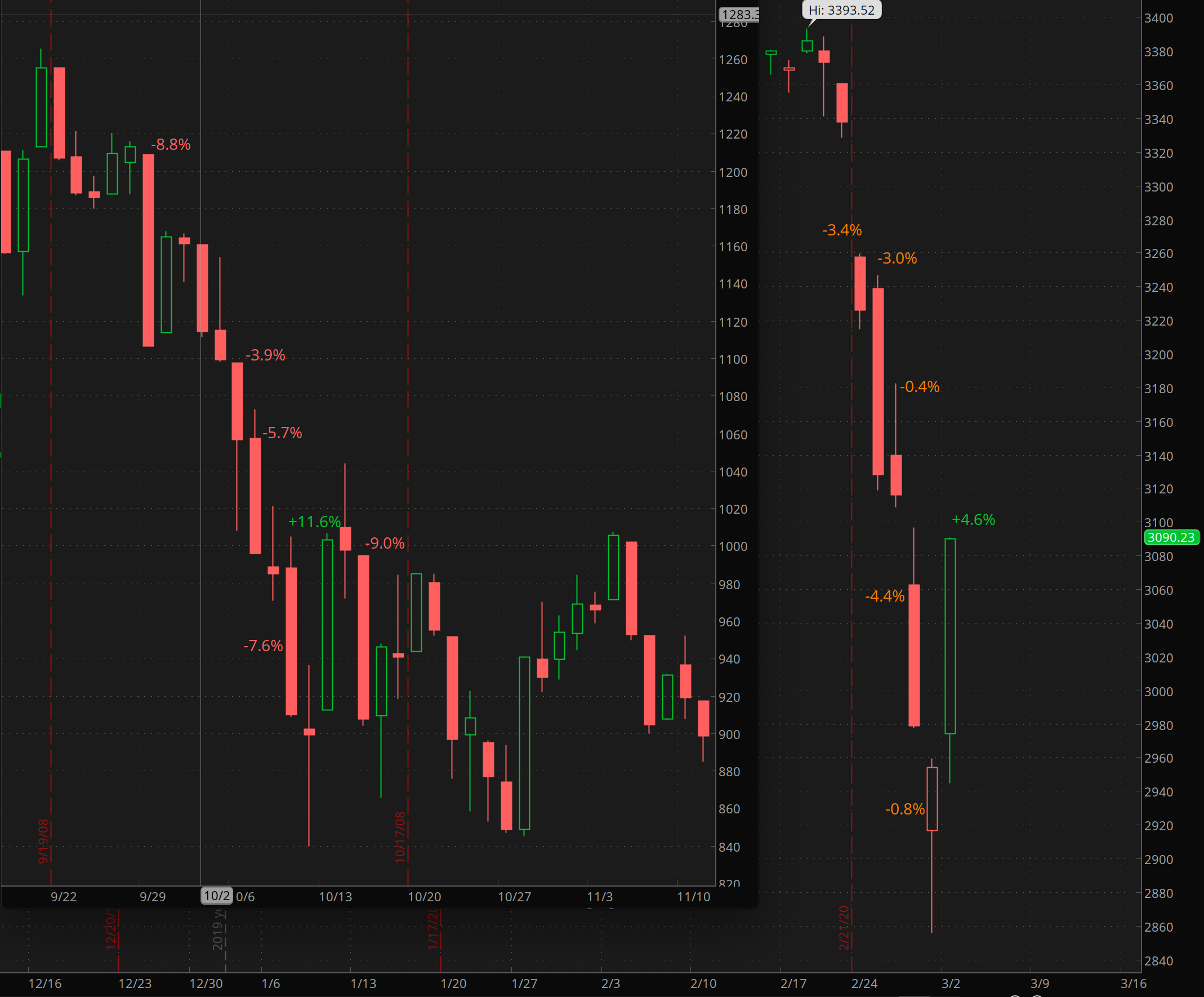
The second resizes the 2020 week so that the scales match on a percentage basis. 2020 is on the left, 2008 on the right:

As you can see, the moves in 2008 were bigger on a percentage basis, while last week was bigger on a point basis.
In 2008, the first huge up day was nowhere near the bottom, which didn’t happen for another five months.
