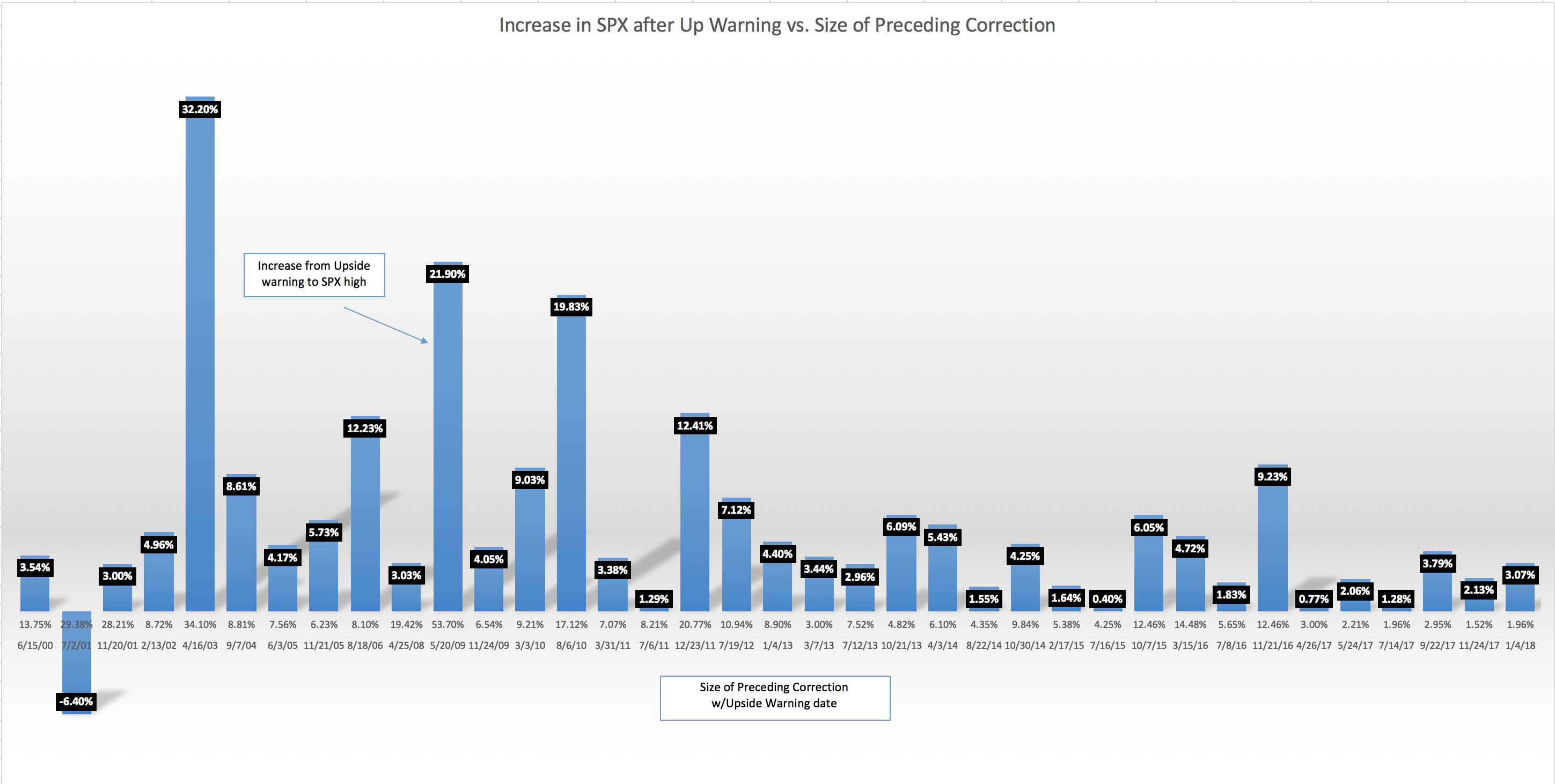
#VIXIndicator Looking less likely we’ll get an Upside Warning today, but in any case here’s an updated version of the chart I posted months ago. The blue bars with numbers on top represent the percentage move UP from the close of an Upside Warning day to the eventual SPX high before another pullback. The numbers at the bottom of each bar are the percentage move DOWN from the preceding correction, and the date of the Upside Warning. Please ask any questions you have! (you can click on the chart to see it full screen)