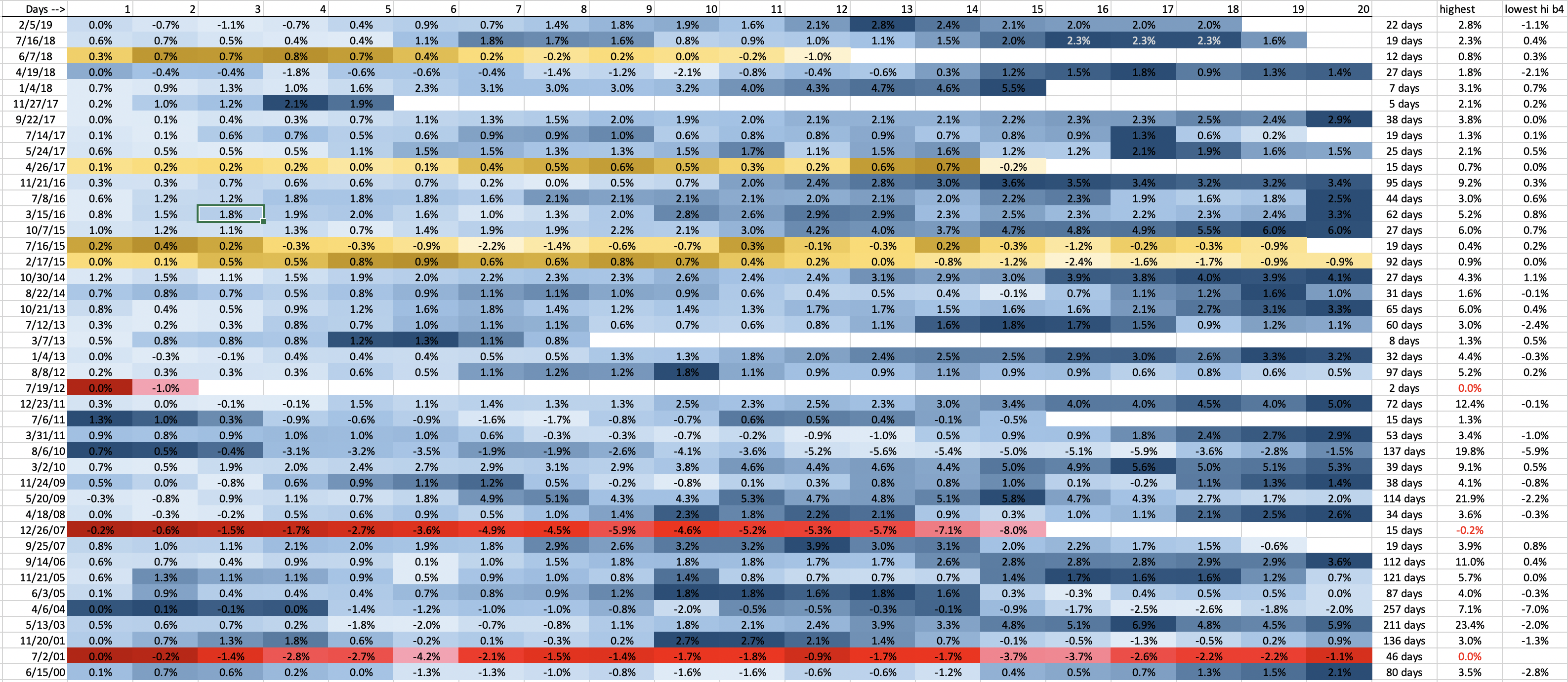
Here’s a new chart examining the data from all occurrences of the upside warning since 1/1/2000.
–Chart includes first 20 days of each day’s SPX HIGH, as a percentage above or below the CLOSING PRICE of the Upside Warning firing date (in the current case, it fired on Friday)
–Blue represent occurrences when the highest move was +1.0% or higher
–Yellow represents a highest move up of less than 1.0%
–Red represents no move higher before the warning is canceled
–Final columns on right are:
—-Number of days in the warning before it was canceled
—-Highest point of SPX during that UpW
—-Lowest SPX high BEFORE the highest point was reached
As you can see, several UpW’s start with a pullback, sometimes quite deep. But eventually, out of 42 warnings, the SPX moved higher 92% of the time, and moved at least 1% higher 83% of the time.
Click on the chart for larger view.